Showing posts with label Illustration. Show all posts

Tuesday, 18 September 2012

Mind mapping and some rough concepts for Logo reDesign


Designers often like to share pictures of their working place. Well, I must say that I don’t really have a fancy place.
 

I had done some mind mapping on a logo redesign I was working upon a while back. Although, I didn’t continue and didn’t get any final out, it helped me organize my thought process a lot. I started out with some rough doodles (basically of anything around) to get my head on track.

 
After that I did some massive mind mapping, explored a lot of design ideas and cleared my head to some extent. It really helped me to see things clearly.

After that, I did get into some rough concepts, but nothing concrete came out of it.


Doodlers Unite!


Recently I finished reading Force. It’s kind of an achievement for me. While reading I took some notes. But this time instead of really taking some notes I had drawn some doodles. You can't really call them notes (as hardly anything can be made out of them), but they helped me remember better. I called this session creative note making.


 Also, do check out this amazing TED talk on doodling!

Monday, 9 July 2012

Pencil Sketching: Landscapes, Buildings & a bit of Illustration

With reference to my previous article I continued with pencil sketching. I reckon from the results that I need to improve greatly on my shading skills.


The architectures  were especially the disasters.


 But the real drawbacks came in memory drawing. I tried a lot and at last I had to give up and look for some photos for ideas.


I tried redesigning the NID and NIFT logo, but couldn't do much.


Then I delved into illustrations. This was the only fruitful task among all.


Friday, 29 June 2012

Cartooning, Poster Design and a bit of Doodling!


With reference to a previous article where I had shared some random ideas on poster design, I’ve drawn the first two of them.


Apart from that I was doing some rough illustration on various topics.


I had completed Drawing on the Funny Side of the Brain, so I was exploring some cartoon characters. Two of them are copied, the rest were drawn by me. I was very much influenced by the book and can't honestly say that it is original work.

Thursday, 28 June 2012

My Last two weeks' update


I started with the above poster on "Morning Walk" and then I realized that my cartooning skills are very poor. So I surfed the net and checked for some cartooning tutorials.


I found a great book on cartoon drawing, Drawing On The Funny Side Of The Brain. Then I thought of doing something on perspective, but I didn't want to draw the same old road with parallel buildings merging at the centre.


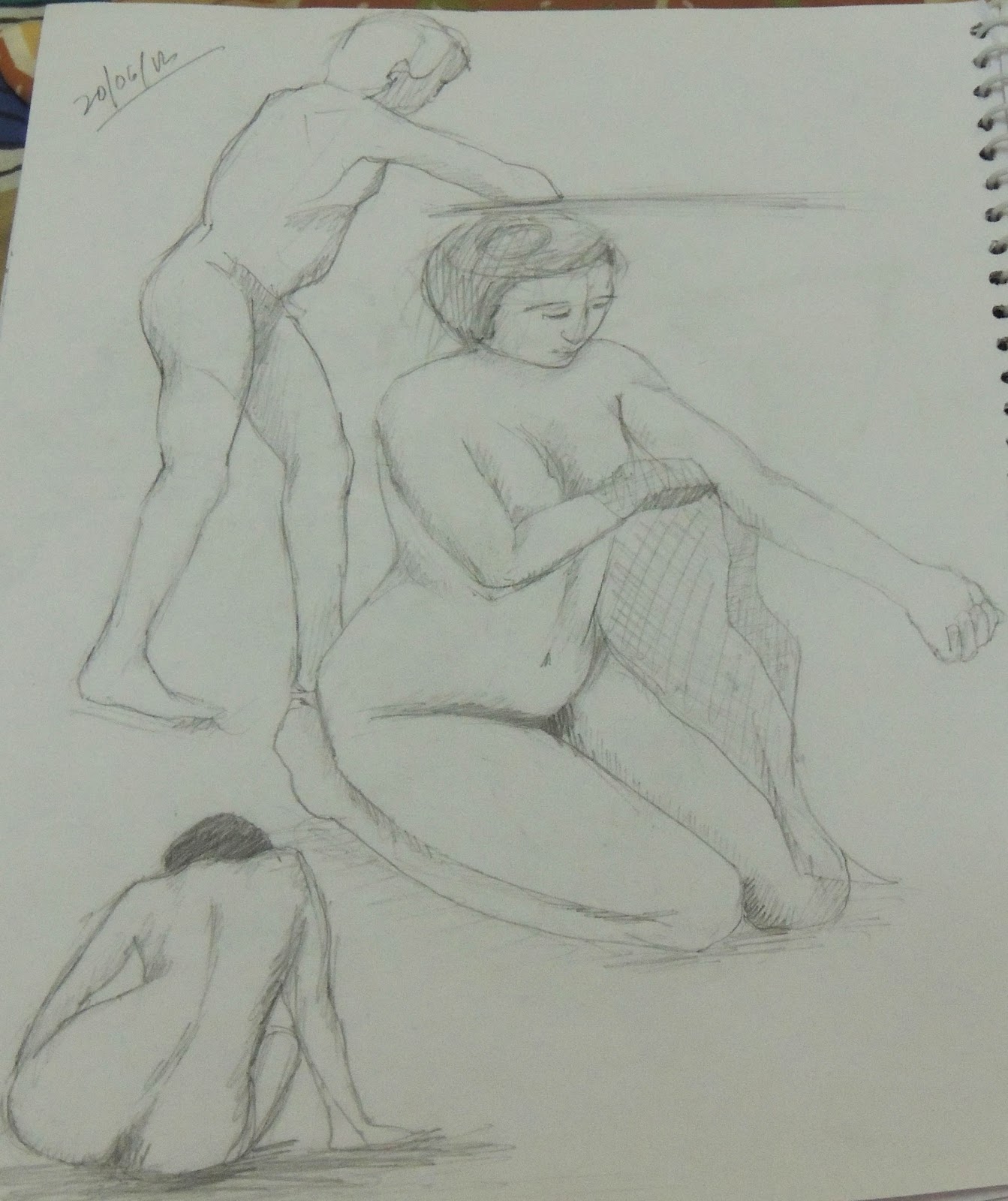
But as always I could not resist myself from drawing some human figures and a portrait.


But the one I particularly liked is the one below. And I had drawn all the sketches with the minimum use of eraser and did not take more than 15 minutes to complete one.

Tuesday, 26 June 2012

Symbols, Icons and Illustrations


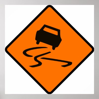
The above image explains what it denotes without anything having written. For those who didn’t understand, it's a warning sign denoting a slippery surface where skidding might occur. That's symbolism. Unlike logo, symbols and signs also provide information. Infographics


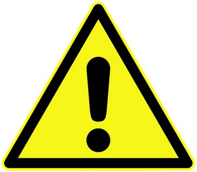
The ‘i’ has always been related to information. Similarly the exclamatory sign denotes a warning. Visual Communication is all about conveying thoughts and information without or with minimum usage of words. There is no hard and fast rule for designing them. The goal is mainly to convey information. The icons in a cell phone doesn’t necessarily need to have names beside them.


The above icon denotes message, while the one below denotes chat (but they are from separate themes).


Some exercise related to illustration/symbolism are given below:
i.                Illustrate the following words: river, electricity, security, idea, hospital, king, direction, restaurant, growth, success, target, freedom, save water, winter, summer, autumn.
ii.         Draw 5 icons/symbols present in mobile phones such as message, media player, settings and redesign them based on themes.
iii.                Draw traffic logos, bank logos, automobile logos, internet logos, govt institution logos, govt office logos, TV channels, fashion brands and sports logos.
iv.                 Design symbols for:
a.       Wear helmet.
b.       Wear ear protection.
c.       Wear goggles.
d.      Slippery floor.
e.       Always use gloves.
f.        Remove footwear
g.       Emergency exit.

Saturday, 23 June 2012

Logo Design 101


This is based on the most recent book I read on logo designing: Logo Design Love. It's a great book. It covers everything from the inception of logo design to the techniques of dealing with clients. Well, as of now I didn’t touch the client dealings part; I went through just the design process.


The above mind map (PDF) is based on just the preliminary design elements. There are certain other topics which cover the design process in details and others such as the study of various designs, being creative etc. They will be discussed later. For the time being lets look at some (in fact a lot of) creative logo designs.

Motion Animation Studio

Music Dog

Zip
 

One
Boundary

EDN
Le Cafe Chat Noir

Fuel

Loop

Sushi

I Hate You

 Milky Mug

Webankor

Typeface

Tyme

Lion Bird

 Antarctica

Airtistic

Black Cat

Black Dog

Dog Paw

Sleep Records

Big Boss

Colour Fruit

Eco Fuel

Crown

Silfver Creations

Thread Me

Wavy Cafe

Techie Talk

Artists United

Girls Talking Smack
Al Capone KNS Oslo


Premium Design

On Wine

Dug

Anti Particle

Electric Elephant

Bison

Martini House


Elena Alexeeva

More

Wiesinger Music

Ruin

Horror Films

Pencil

Idea

Human

Silvia

Seven Sparrows

Water Drop

 Guitar Shop

Most of these logos make a lot of use of the negative space. Some of them have beautiful typography. All most all of them use the elements which the name signifies and make beautiful use of them. The ones having their names in bold are those which I found most fascinating.