Saturday, 16 June 2012

Human Anatomy Part II


Ideally the human body is divided into 7 ½ heads (in some cases it is taken as 8). Taking this into account it becomes easy to draw any figure in any position without blowing off the proportions.


The above figure consists of 8 head units(approx 6 feet in height). Note the space between nipples is one head unit.  The waist is a little wider than one head unit. The wrist drops just below the crotch. The palm is ideally 2/3 head unit. The elbows are bout on a line with the navel. The knees are just above the lower quarter of the figure. The shoulders are one-sixth of the way down.


 The female figure is relatively narrower – two heads at the widest point. The nipples are slightly lower than in the male. The waistline measures one head unit across. In front the thighs are slightly wider than the armpits, narrower in back. It is optional whether or not you draw the legs even a little longer from the knees down. Wrists are even with crotch. Five feet eight inches is considered an ideal height for a girl. Note that the female navel is below the waistline; the male, above or even with it. The nipples and navels are one head apart but both are dropped below the head divisions. The elbow is above the navel.


It is a good practice to start the sketch with a stick drawing (considering proper head counts). This gives us an overall idea how the final figure would look and also gives us chance to make quick corrections if necessary. Drawing the chest and the buttock helps us shape the body properly. There are a few examples of  stick drawing in Human Anatomy Part I.

Good reference books are available for learning to draw figure properly. Figure Drawing: Made Easy is a good one. It has got many illustrations with good examples. It does not go much into technical details and consists of mainly sketches and paintings rather than theory. It can be a good reference for beginners. Another more popular (and costlier) one is Figure Drawing: For All It's Worth. This is one for the pros, and its discusses figure drawing from all aspects and touches every nook and corner of it. It has both theory and illustrations. It's a great book indeed!

Monday, 11 June 2012

Cartooning + Figure


I was trying my hand at cartooning. I couldn’t find any good reference for it, so I had to stop in the middle. I just tried learning to draw a few expressions.


Apart from that, I sketched in colour (along with a pencil sketch) this time for a change.


Saturday, 9 June 2012

Poster Design Ideas: Random


With reference to the topic of Poster Design discussed here, I've generated few ideas for designing them. These ideas are mainly random and don't follow any particular style or theme. Next type I'm planning to take up the same topic, but focus on style based idea generation like typography, vector art, cartoon etc.

Walking is good for health: Like the evolution of man, a tired walking fat man evolves into a thin energetic one. This can be done in silhouette. Tagline might read: Mr. Walker gets thinner.

Stop child labour: A child is seen standing with a container full of stones on his head. He casts a shadow where he is seen with a balloon in his hand. Tagline: I’m poor, but human. I deserve a childhood like others.

Anti corruption: A hand offering money under the table, another hand showing the middle finger. Tagline: It's time to say ‘f@#k you’ to bribes. This a funny way, although somewhat offensive. The middle finger maybe replaced by hand cuffs or a pistol.

A group of people dancing around a bone fire burning black money. A person is seen dumping something in the fire, on the container it's written black money. Can be done in cartoon.

Save environment: This topic can be broken down into it's attributes. Like save water, save electricity etc. I think it's better to approach them rather than directly approaching environment. There is a very good example of a poster depicting harvesting of rain water. An upside down blue umbrella with the handle modified into a tap. In case of saving electricity, an inverted light bulb is placed with a candle lit above it. Another example of saving water might be a bird sitting on a tap is putting its beak inside the tap to drink water. Tagline: Birds without water, die together. A man reading a newspaper in a forest where all trees have been hacked. Tagline says: Save paper. Go mobile.

Educating voters: A person is holding a pamphlet upon his face covering it. In the pamphlet it's written, “Vote smart. Don't get biased!”

Corruption: A child watches two people exchanging money. their faces are not shown. One of them might even be his father. Tagline: This is not what we want our children to learn, do we?

Right to education: A child is standing at the edge of the screen with his back to us. Only the hand and a bit if the body is seen. At a distance another child is seen with a bag on his back going to school. The first child is watching the other one. Tagline: Right to education. Every child's right.

Climate change: Like environment, climate is a huge area. The poster can focus upon various causes, effects, ways of prevention etc. A penguin is seen sweating under the sun (cartoon). Or maybe a polar bear standing on a small chunk of ice in a vast ocean. A huge ship is seen standing still on a dry and cracked ground. A small plant has grown in a famine stricken land full of cracks. Tagline: Our last hope will die slowly without water.

Traffic signals: Rajnikanth  is seen bending down and holding a car from hitting him while dodging another car flying in the air. Tagline: Everybody can't be Rajnikanth. Follow traffic signals.

Technology growth: the right half of the page has the growth in height of buildings. The left half shows a rocket launching (in frames). Tagline goes in the middle: embrace technology. Embrace growth.

Imagine yourself to be a pet shop owner selling elephants. Design a poster to advertise your shop: An elephant (with it's owner sitting on top) scaring a dog (and it's owner) away. Below the dog, it says faithful. Below the elephant it says faithful and powerful. The tagline reads, “Your call!”

The week that was....


Last week I mainly concentrated on human figures. During my practice I tried for the minimal use of eraser. I  tried to capture action and force of the human figures.


I am totally unsatisfied with my work and this only indicates that I need more and more practice. But one thing I found is that browsing through the art works of different artists helps. Here is a copy from Leonardo Da Vinci's diary.


Thursday, 7 June 2012

Poster, Banner, Postal Stamp Design


This week I got a little late with the update. It's poster design time. In a nutshell, I found that an an effective poster should be …
                        ·         Aesthetic – It should get attention so the message is delivered.
·         Focused – It should focus on a single message.
·         Ordered – The sequence should be well-ordered and obvious.
Lets study a few posters. The following poster has a boy and a girl sitting in a bench. For obvious reasons it portrays a love story. The tagline further clarifies that. Apart from the persons, the environment has been sketched. The typography of the names of the actors on top agrees with the environment. As the name has the word summer in it, the sun is bright and highlighted (prop). 
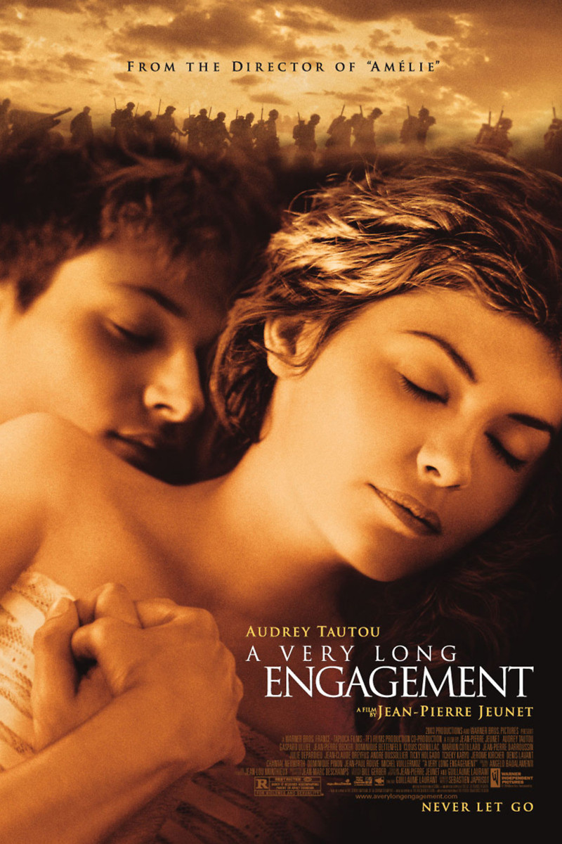
The following poster also has a boy and a girl in it. It is also a love story. The marching soldiers on top says that it's a love story in times of war. In spite of the reference to war, one knows that it's not a war story. The sepia tint gives a feel that it's a period drama.


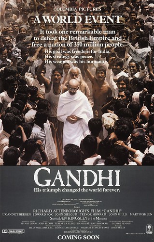
The following poster also is in sepia. The sword and the shield (along with the expression) gives the feel of warfare and violence. The presence of only one man in the poster gives the hint that it's a biopic (but that is not always necessary). 

The use of props can always give indications of the theme. The following poster consists of a pair of Gandhi specs. It may denote that it's about Gandhi, or his principles. Or it may denote nonviolence. But there is no image of Gandhi in the poster. A walking stick may not always denote Gandhi. (That represents usually an old person.)

But if we add some blood, the whole idea changes. It depicts violence on innocence. Or it may denote the assassination of Gandhi. In the same way, a gun denotes violence and a flower denotes love.

The typography of a poster is also important. Period films have a different type design, romantic films have other types, war drama, sci-fi and historical films have their own. Here are some examples.


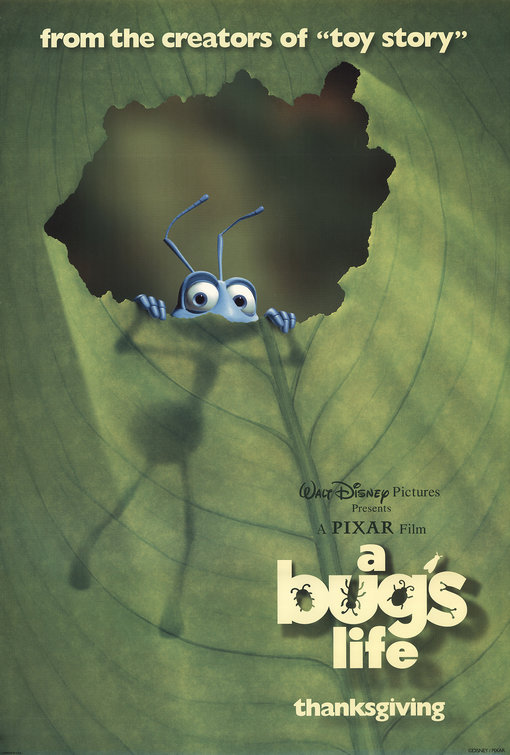
A Bug’s Life is a great movie. Come to think of it, the poster maybe designed is various ways (not necessarily does it have to be reminiscent to the story). Few bugs dining in a table where sandwiches are made of leaves, twigs etc maybe one way to look at it. Grandpa bug telling a story to a little one maybe another example. Two cockroaches/rats wearing aprons dressed as chefs cooking up something is another funny way. The name of the movie maybe written with melting cheese/butter.

Initially it's a better practice to design based on quantitative ideas, rather than being qualitative (for aspiring designers). Showcasing of designing/sketching skills is important in the beginning. Minimalistic design with empty spaces can be designed after one has established himself.

Poster are not necessarily made only for movies. They can relate to other things also. When designing posters it's always better to avoid clichés. When designing a poster for climate change/global warming one usually goes for the earth. It's not necessary to design a poster keeping earth in the main focus. The effects can also be highlighted. In fact the posters can also be many funny sometimes. A middle aged man riding a scooter with a huge A.C. as his backpack maybe be one way to represent global warming. Polar bears playing carom, an indoor game (rather than football, an outdoor game) as the snow has melted maybe another humorous way to depict it. Sun sucking energy out of playing children with a straw attached can be another way to look at it. the main aim is to make impact. The best way to attract attention is to try something new which hasn’t been done. Being unique.

The difference between a poster and a banner is in it's size and information. Posters are mainly to create hype. Banner also serves the same purpose, but it is also an invitation. Banners are mainly for events (e.g. rock shows), whereas posters are for movies, awareness etc. A banner is spread along it's length and consists date and other information about an event.

Postage stamps are generally 1”, 2”, 2 ½” in size. They can be square or rectangle. They are usually made to remember events, such as Independence day, someone’s birthday etc. Stamps never portray negativity, and they usually don't have anything written over them. Only an image portrays what they want to showcase.


 Few topics of poster design are give below:
i.                    Walking is good for health
ii.                  Stop child labour
iii.                Anti corruption
iv.                 Save environment
v.                   Educating voters
vi.                 Corruption
vii.               Right to education
viii.             Climate change
ix.                 Traffic signals
x.                   Technology growth
xi.                 Imagine yourself to be a pet shop owner selling elephants. Design a poster to advertise your shop.
Postal Stamp design topics:
i.                    Kill terrorism
ii.                  Nuclear power
iii.                Chandrayaan I mission
iv.                 Education is important
v.                   M. F. Hussein
vi.                 Common Wealth games
vii.               Information technology
viii.             Delhi Metro
ix.                 World Environment day
x.                   Mother’s Day
xi.                 World Health Day
xii.               Father’s Day
xiii.             Save girl child
xiv.              Teacher’s Day
xv.                Save Wild Life
xvi.              Eradication of child labour.
xvii.            Victory of Indian Army in 1971
Banner/Hoarding Design:
i.                    Banner/ Hoarding inviting general public to a rock show in your school/college
ii.                  Banner/ Hoarding creating awareness among general public doe Pulse polio.

Monday, 4 June 2012

Numbered Furniture

There isn't much on the plate now. These are two sofa designs inspired by the digits 6 and 8. They took some time to be drawn. Maybe 2hrs. The extended part of the 6 shape can also be used as a table for placing tea etc. The 8 is a two sided sofa. It can be used in the lobby of hotels etc.


Apart from that here is a sketch


Wednesday, 30 May 2012

Egged!


Egg is a common shape. It can be found anywhere. Here are five shapes inspired from an egg.


This is a rough sketch; was completed merely in 10-15 mins. I loved it this way, so didn’t go on to make it look real and add proper shades. I could have worked a bit on the face, but I didn’t want to use the eraser. I hate it. Clearly I was restless when I was sketching it. The more I completed the more restless I grew. Oh and the whole sketch was completed without a single touch of the eraser.