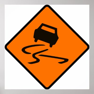
The above image
explains what it denotes without anything having written. For those who didn’t understand,
it's a warning sign denoting a slippery surface where skidding might occur. That's
symbolism. Unlike logo, symbols and signs also provide information. Infographics.
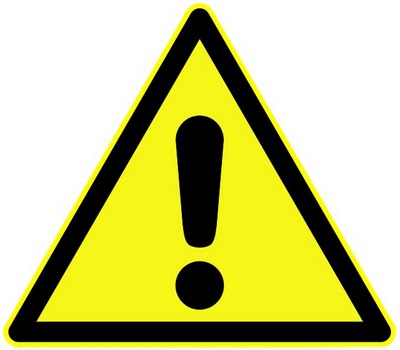
The ‘i’ has
always been related to information. Similarly the exclamatory sign denotes a
warning. Visual Communication is all about conveying thoughts and information without
or with minimum usage of words. There is no hard and fast rule for designing them. The goal is mainly to convey information. The icons in a cell phone doesn’t necessarily
need to have names beside them.
The above icon
denotes message, while the one below denotes chat (but they are from separate themes).
Some exercise
related to illustration/symbolism are given below:
i. Illustrate the following words:
river, electricity, security, idea, hospital, king, direction, restaurant,
growth, success, target, freedom, save water, winter, summer, autumn.
ii. Draw 5 icons/symbols present in
mobile phones such as message, media player, settings and redesign them based
on themes.
iii.
Draw traffic logos, bank logos,
automobile logos, internet logos, govt institution logos, govt office logos, TV
channels, fashion brands and sports logos.
iv.
Design symbols for:
a.
Wear helmet.
b.
Wear ear protection.
c.
Wear goggles.
d.
Slippery floor.
e.
Always use gloves.
f.
Remove footwear
g.
Emergency exit.